Make it stand out
Magazine Cover
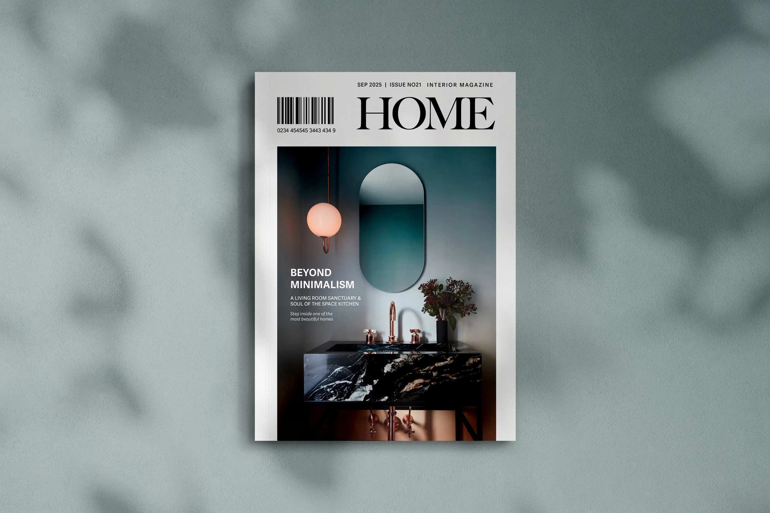
The cover is a standout example of image led editorial design,
where the photograph takes centre stage and every graphic element is deliberately understated to let it shine - the publications name
the only exception. Its strikingly minimalist yet impactful.
Text hierarchy & placement is clean and deliberate.
The smaller subheadings are neatly aligned, maintaining readability
without detracting from the visual centrepiece.
![Mag [Home] Inside 2.jpg](https://images.squarespace-cdn.com/content/v1/5ece0419b32b8a7d6b8b7753/1c093418-9fa9-4410-b03f-efd0c1fde7f6/Mag+%5BHome%5D+Inside+2.jpg)
![Mag [Home] Inside 3.jpg](https://images.squarespace-cdn.com/content/v1/5ece0419b32b8a7d6b8b7753/b634c799-05c0-4a4f-9970-abd3f4fea96b/Mag+%5BHome%5D+Inside+3.jpg)
![Mag [Home] Inside 5.jpg](https://images.squarespace-cdn.com/content/v1/5ece0419b32b8a7d6b8b7753/b260c014-552b-488d-a2e7-9251ed261213/Mag+%5BHome%5D+Inside+5.jpg)
![Mag [Home] Inside 4.jpg](https://images.squarespace-cdn.com/content/v1/5ece0419b32b8a7d6b8b7753/7ebb0b2e-4b2c-4d92-aa90-5524ef264445/Mag+%5BHome%5D+Inside+4.jpg)
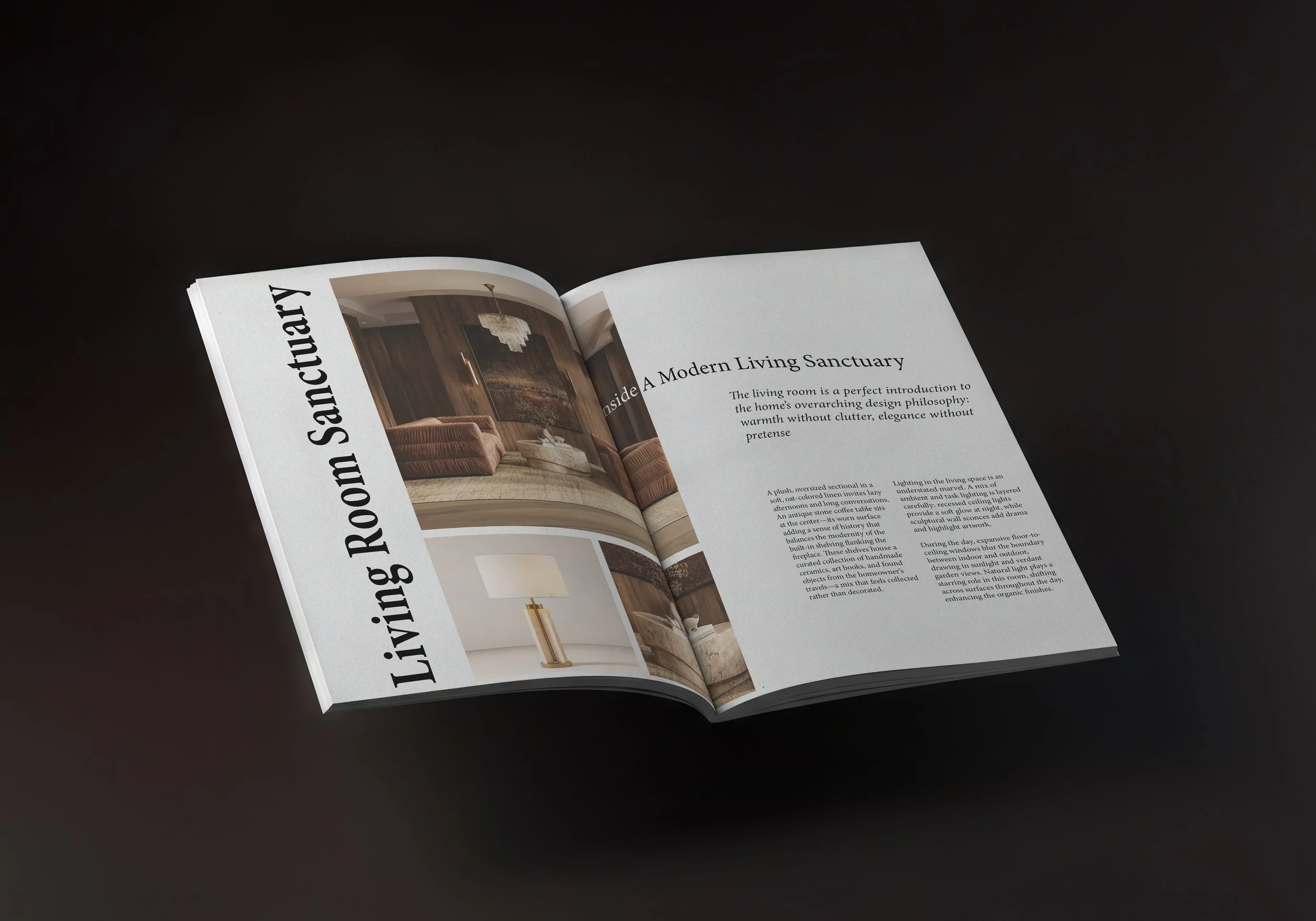
Interior Spreads
Each spread adheres to a modular grid, The mix of vertical and horizontal photo orientations creates visual rhythm, while asymmetrical layouts
add interest without clutter.
The serif typeface lends a timeless editorial feel.
The use of vertical text placement adds sophistication
and a sense of movement.
The colour palette is intentionally subdued – leaning on neutral backgrounds and natural tones. This allows the images to drive emotion while the design maintains cohesion.
HOME
HOME