
Shop Front
〰️
Shop Front 〰️
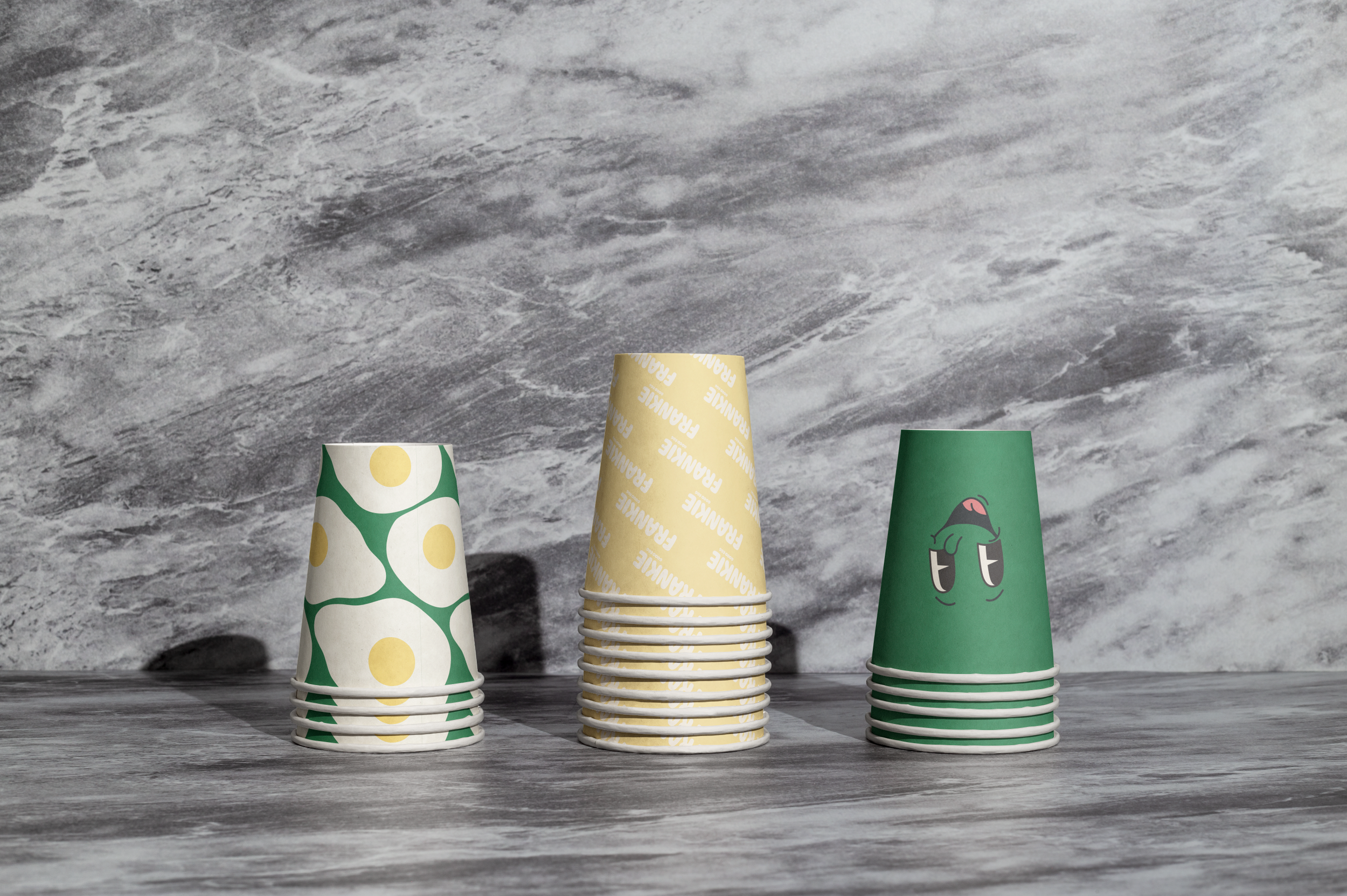
coffee to go
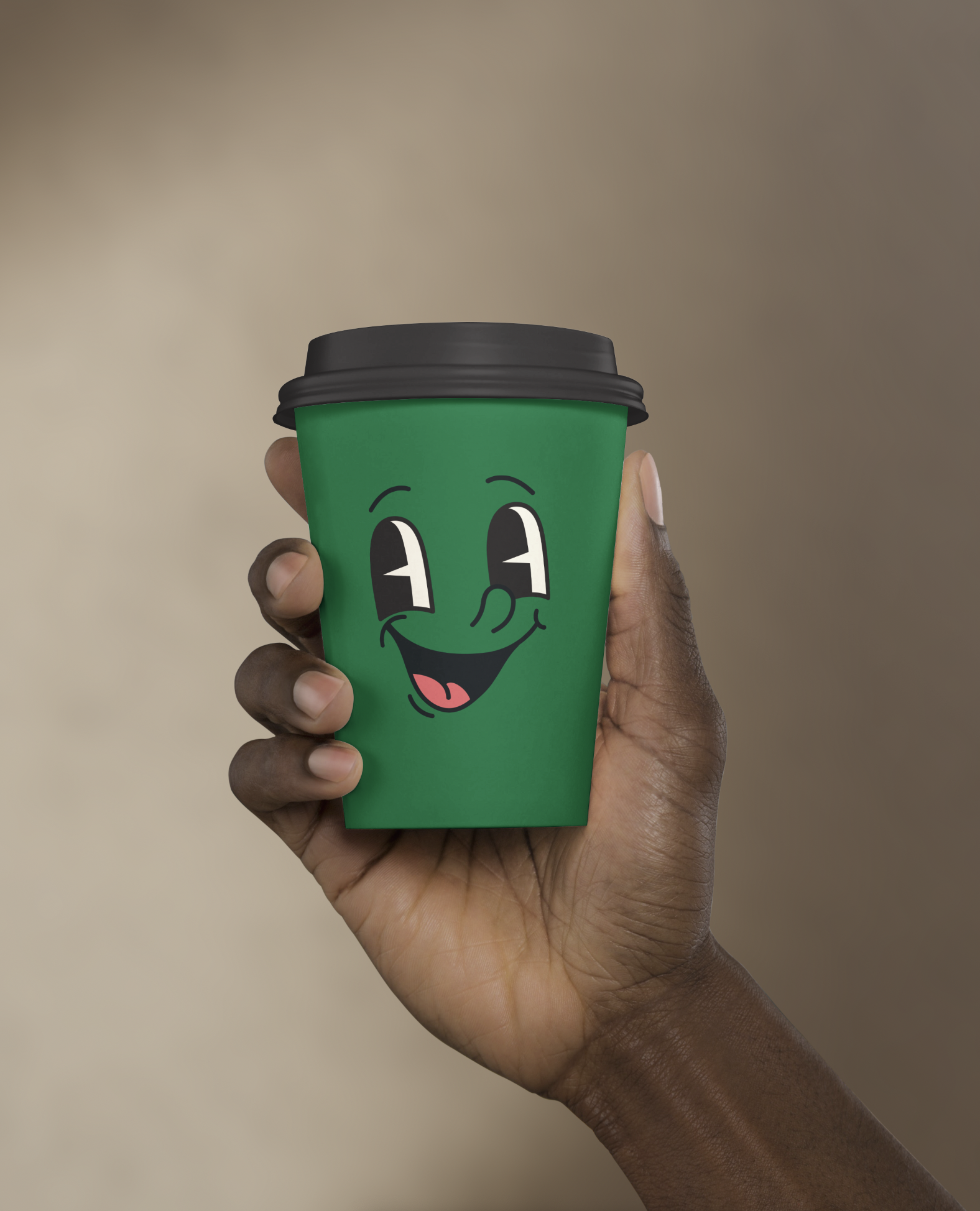
The design for Frankie Good Egg is playful, cheerful,
instantly welcoming and highly character-driven,
making it stand out as a coffee shop identity.
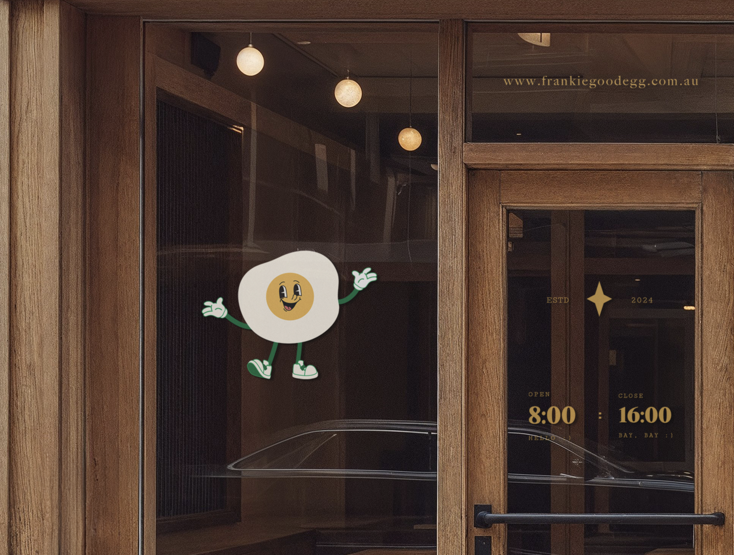
With its friendly, cartoon style, fried-egg character,
brought to life through expressive eyes, a big smile,
the identity leans into a nostalgic, retro-inspired charm.
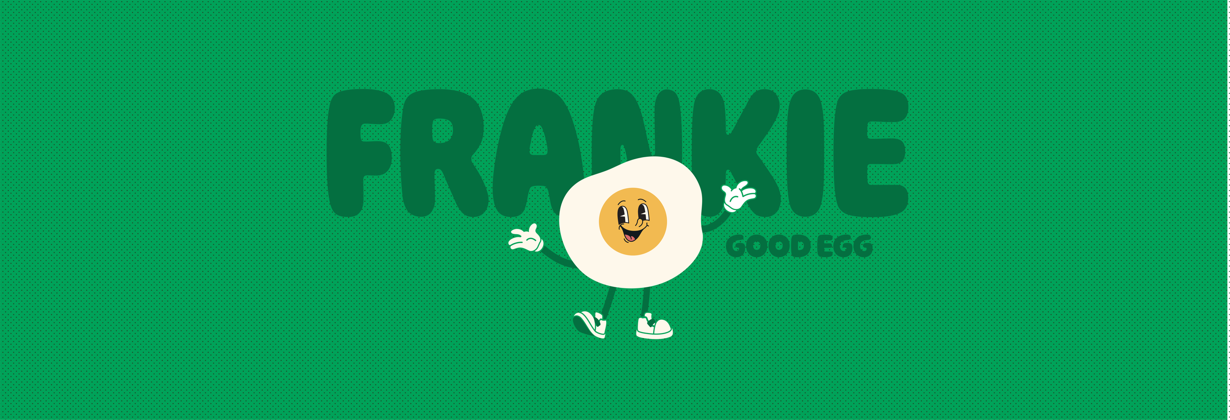
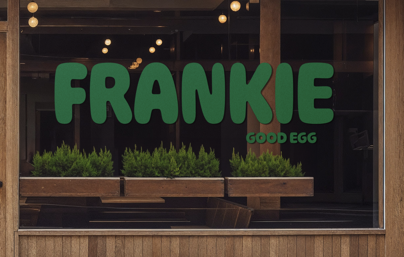
The typography is chunky and rounded,
echoing the softness of the egg theme while ensuring
the brand name feels approachable and easy to read.
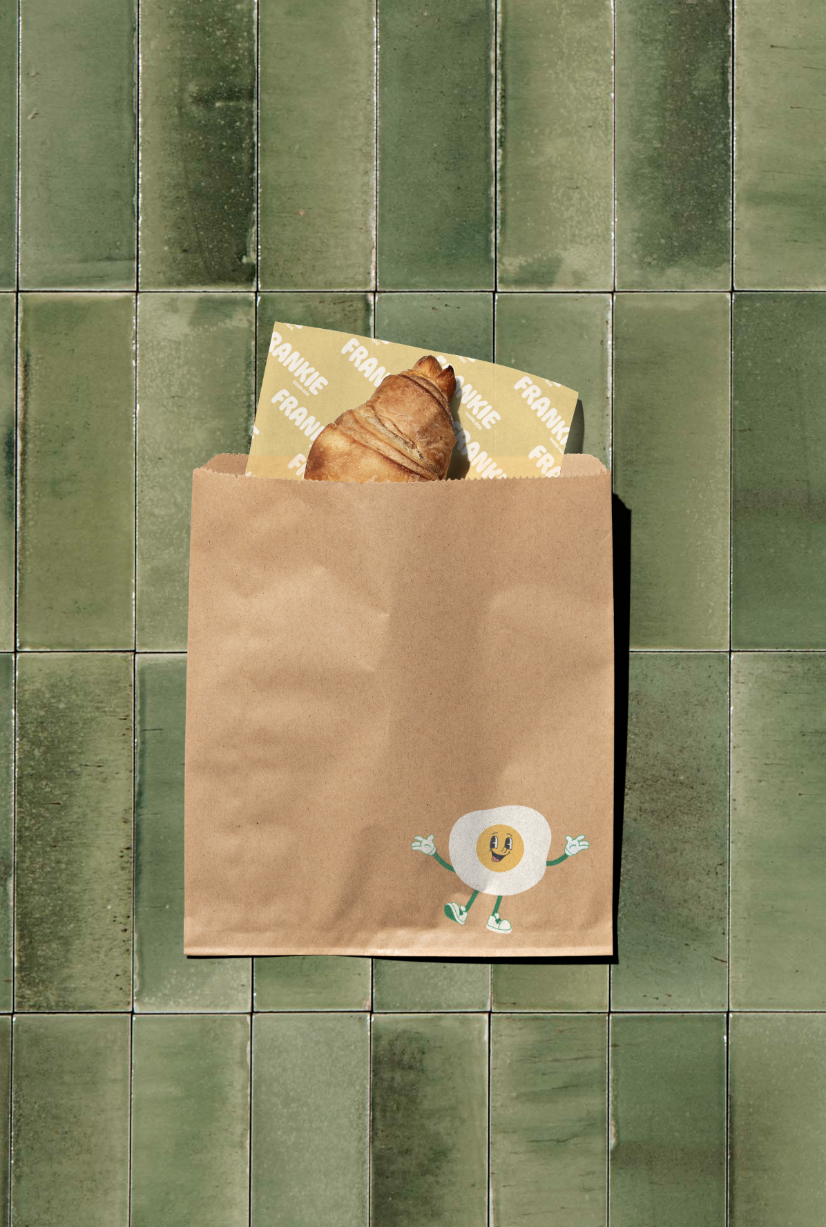
A consistent green colour palette ties everything together, balancing playfulness with a natural, earthy tone that works well on the brown tones in the natural paper packaging. The use of bright yellow adds energy and positivity, symbolising freshness and fun.
The use of simple line illustrations, depicting eggs enjoying breakfast, reinforces the light hearted personality of the brand and extends the branding into a whole new wonderful world.
The retro-inspired artwork, characterized by its crisp, clean,
and curvaceous linework, is carried consistently across the poster, coffee cups, and wax paper designs. Each element draws inspiration from the brand’s playful mascot, Frankie the Good Egg. These designs capture a contemporary freshness through simplified forms and balanced compositions, creating a cohesive visual language that feels both familiar and modern.
Overall, Frankie Good Egg uses playful illustration, approachable typography, and earthy yet vibrant colour choices to create a cohesive and inviting brand. The design strikes the perfect balance between fun and refined, giving off a sense of comfort, quality, and friendliness that fits a modern brunch café with personality. Welcome to Frankie Good Egg.

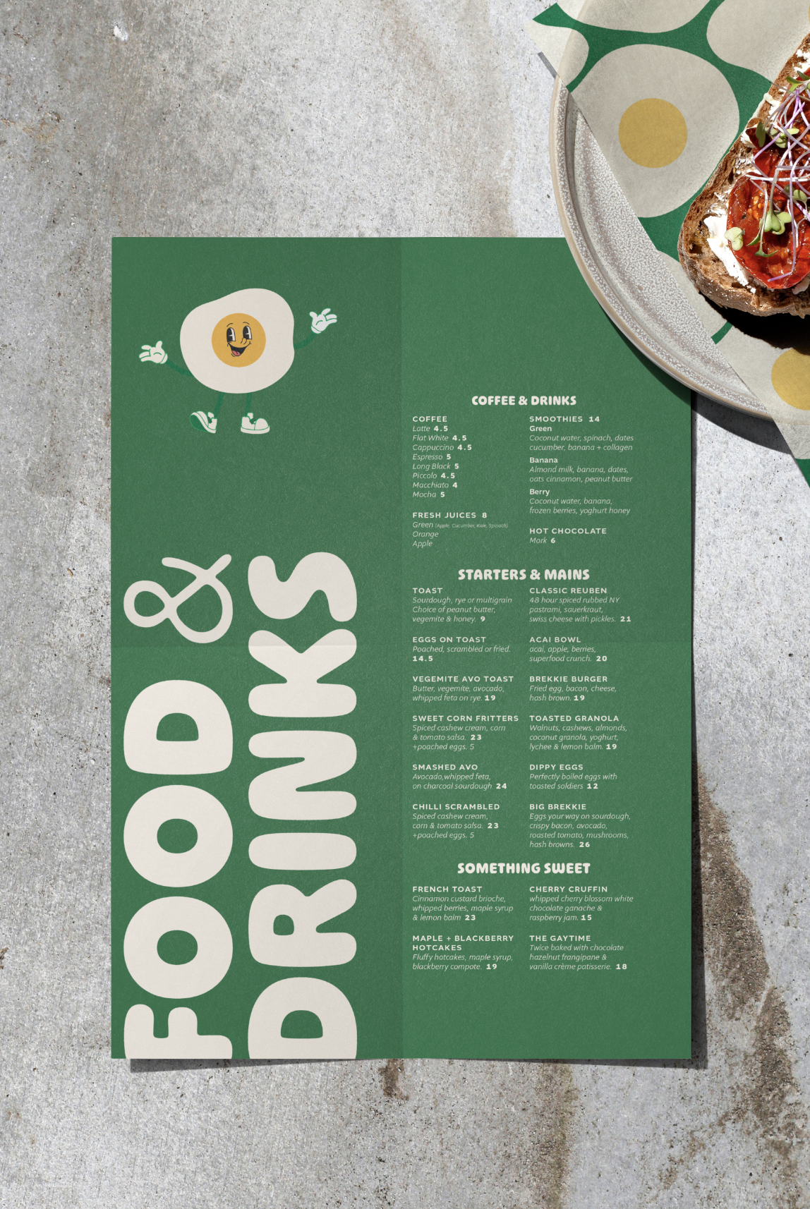
menu &
Food wrap
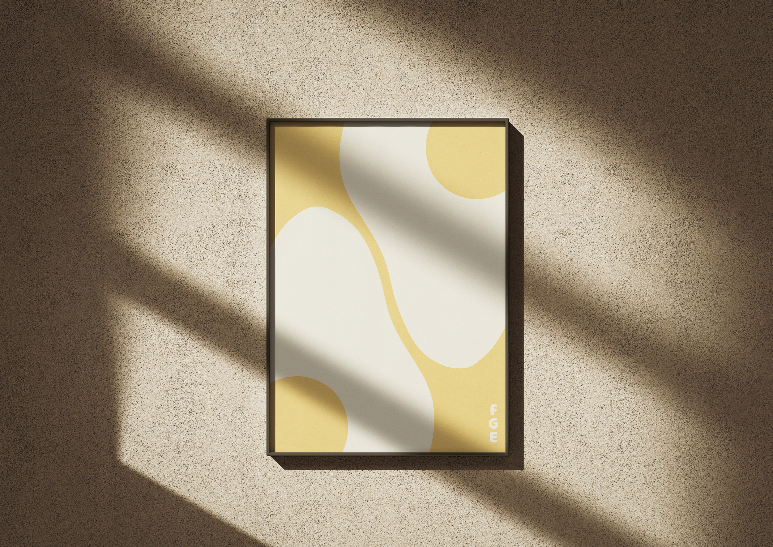
poster

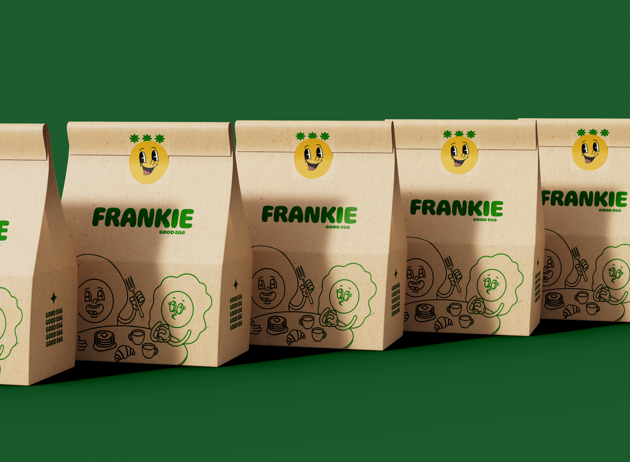
takeaway
〰️
takeaway 〰️
